Wasp Barcode Technologies: The Barcode Solution People
The Small Business Secret of not Being Ignored – Part 4
 Sean Jackson
Copyblogger Sean Jackson
Copyblogger |
In this post I would like to share a strategy for building out your website by using keyword research, and implementing back-linking. This will cover two of the five components I shared in my first post. |
If
content and search engine optimization are siblings, then the architecture, or aesthetics, of a website is their cousin. Architecture should be determined by the keywords chosen and aesthetics should line up accordingly. Each page needs to correlate with the keywords adapted for your content strategy. Unfortunately, many make the mistake of focusing on the beauty of the website rather than ease of navigation. While an aesthetically pleasing website is valuable because it makes a good first impression, navigability is part of the Google algorithm and it makes the user experience better and more efficient.
If you recall in the last post about
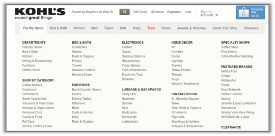
keyword research, I identified how to go about locating the best words for your message. The core keywords (words that describe your service or product) should be found both on your website’s home page and the landing pages (“About Us”, “Contact” and “FAQ” pages are all common landing pages). E-commerce websites often deploy keywords as landing pages. For example, Kohl’s has tabs: “For the Home”, “Bed & Bath”, “Women”, “Men”, etc. These terms are targeted keywords of Kohl’s products. If you click on any of the above tabs a drop down menu will give you a list of supporting keywords.
 When I clicked on “For the Home” the supporting keywords: “Furniture”, “Electronics”, “Home Décor”, “Luggage & Backpacks”, “Holiday Décor”, “Specialty Shops”, etc. are displayed. These are the semantic keywords Kohl’s found during their keyword research. Each of the supporting keywords is its own landing page.
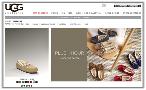
 Many times companies opt to target Branded Keywords. If someone were shopping for UGGs, they would most likely type that word into the search bar. The word UGGs is a branded term. A branded keyword can also be the name of the pair of UGGs, like Dakota (a pair of UGG slippers). The optimized term would be “UGG Dakota Slippers.”
E-Commerce sites have been using the keyword landing page strategy for a while because it helps users navigate to their desired product. Other business sites have begun to implement keywords as targeted landing pages in the hopes their services and products can be easily understood and viewed.
While incorporating this strategy it is important to know which user you are targeted. There are two types of users, the first is someone who is browsing and taking their time viewing a variety of options, and the second is someone who needs assistance immediately. Gearing your phrasing, content and navigation according to landing page and user will help both users get to where they want to go. For example, if someone already knows they want to call a service representative, a “Contact Us” page will provide that information. On the flip side, if a user wants to research common HVAC problems and ways to fix those problems without calling a rep. having a resource page would satisfy their needs.
As a provider it is important to keep in mind that there are few things more frustrating than searching for help or answers and not being able to find it on a website. This is true especially in an emergency, like having no heat in the winter.
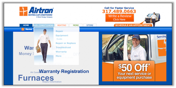
Below is the Airtron Indy, a Direct Energy division providing HVAC services, home page. By clicking on the Air Conditioning tab I was given options such as Repair, Equipment Guide, etc. Airtron Indy deployed stemming keywords to build out their landing pages. If I were a customer in need of air conditioning repair, I would have easily found the help I needed, which would push me to convert quickly.

Another way businesses have created an easy way for users to navigate a site is incorporating back-linking along with the tabs. Tabs are an efficient way to help users get information such as “Contact”, “About Us” and “Home” as described above, but back-linking can be the breadcrumbs for users (and the bots) to travel through a site.
Back-linking is a tactic used in blogging. Take this blog for example. I’ve linked back to the three previous blogs in case users were interested in reading or referencing them. Instead of having a tab that provides a drop down of all the blogs written, businesses should take advantage of linking back to old posts that relate to what’s written. Or, if a post is related to advice about a product or service, the business should link to the product page.
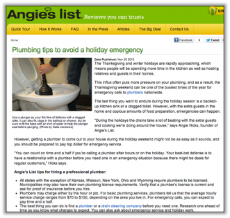
 Angie’s List is a great example of a company leveraging back-links. “Plumber” and “drain cleaning company” are both hyperlinked back to the services page, giving users an opportunity to find contact information quickly. There are also other links further down which encourage readers to sign up for more Angie’s List perks, as well as a section which provides readers with more articles similar to the one read.
Note how Angie’s List also employs tabs at the top – this is just a quick way to direct users, whereas back-linking is a resource to help users find more information.
A beautiful page is always nice to look at, and can even encourage users to stay and look around. However, an easy to navigate page can increase conversion because users are able to find what they want quickly.
Stay tuned for the next, and final, post about incorporating a company blog on a website. The post will be published 12-11-12. In the meantime, reach out with questions or concerns. Comment below if you agree, or if you have other thoughts about SEO, aesthetics, back-linking and content. We’d love to hear your feedback!

