Wasp Barcode Technologies: The Barcode Solution People
Take Advantage of the New LinkedIn Profile Layout

LinkedIn is following suit with an updated company page design. Like the
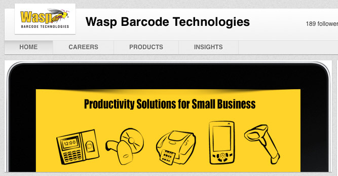
Twitter layout update, LinkedIn company pages now feature a prominent image across the top of the page.
A couple months ago, LinkedIn initiated an ambitious redesign, making the primarily business-focused social platform more modern aesthetically and technologically, as LinkedIn profiles finally became mobile-friendly.
They weren’t done playing catch up, however, as today’s update for business pages is a clear copycat play on Facebook’s cover photos and Twitter’s newly implemented header images. Great news for businesses, small and large, who now have an additional opportunity to show off their branding and we suggest taking advantage of this real estate.
Now, how exactly do you achieve that?
- Go to your company’s profile page and note the large banner across the top: “Your Company Page will look even better once you add an image. Upload an image now.” Click this banner.

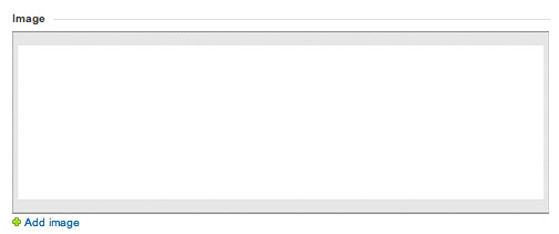
- This will link to the “Overview” page. Notice a large white box in the bottom left under the word “Image.” Click “Add image” to the bottom left of the box.

- An “Add Image” box will appear. Click “Choose File” and select your image.

The image should be a PNG, JPEG, or GIF with a maximum size of 2 MB. The image will be cropped to 646X220, so keep those dimensions in mind when designing your new header image.
Unlike Twitter’s new header image and Facebook’s cover photo, however, there’s no interaction between this image and your small icon photo. You are free of restraints—or pressure to be clever—with the design of this image. We recommend including a few words of text that really epitomize your brand.
Best of luck and stay on your toes for the next social platform update for business!


