Wasp Barcode Technologies: The Barcode Solution People
How to Get More Leads from Your Website
How do you feel about your company’s website? Like it? Love it? Hate it? Many small business owners are a bit disappointed with their websites. Too often, it’s because they have yet to see their sites deliver much new business.
The whole point of a business website is to bring in more business. Usually, that means more leads. If you’re not getting enough leads from your website, you're probably going to be disappointed with it. You might even say it’s not important to your business.
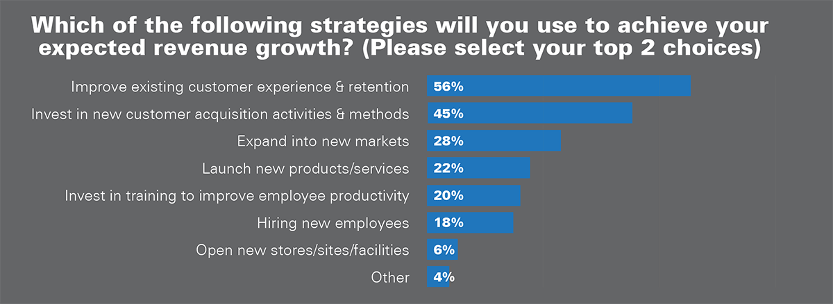
Earlier this year we asked
small business owners “how important is your company website to your business success?” They gave us surprisingly different answers.

Caption: Chart is from the Wasp Barcode Technologies 2015
State of Small Business Report
About a third of these small business owners (35%) said their
website was “extremely important” or “very important” to their business. That’s great. It’s a sign of someone getting good results from their website.
Roughly half of business owners said their website is “important”, or “somewhat important”. The remaining 17% said their company website is either “not important at all” or “not applicable”. We suspect the “not applicable” answers come from owners who don’t yet have a site.
I’m particularly concerned about the owners who said their site was “somewhat important” or “not important at all”. That’s usually a sign of having a website that’s not generating much new business. Let’s hope you’re not in that camp. Either way, there’s always room for more leads. In fact, from that same survey we learned that 45% of small business owners, nearly half, intend to “invest in new customer acquisition activities and method.” Optimizing your website for
more lead generation fits neatly into that goal.

To help you do that, let’s walk through a few ways to take your website from “brochureware” to a lead generation machine.
1) Make it easy to find your contact information.
Almost every site in the world has a “contact us” page. That’s a good start, but too often the link to find the contact page can be hard to get to.
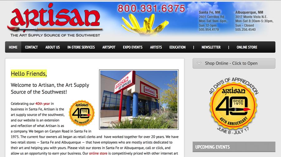
Remember: Most of your site visitors won’t be perusing your site on a desktop. They’ll be using a mobile device, usually a phone. They may well be doing something else while they check your site, like driving or talking to someone. You have to make it super-easy for them to find what they need. So include a phone number, your address and your hours of business on every page.
The footer area of each page is a good spot for this information. Some websites manage to design the header area of their website so the primary contact information is extra easy to find. That’s even better.

Caption: This website design has the phone number, addresses and store hours clearly visible in the top of every page.
2) Include prompts to join your email list.
According to our survey, about half of you are
using email marketing. That’s great. It also means you need to build your email list at every chance you get.
Building an email list doesn’t mean you have to smash an opt-in box into every single spot on your site. Adding it to just a few choice spots will get the best results:
- At the top of the navigation column (the skinny section just to the right or left of your main content area).
- In the footer of every page on your site
- At the close of your blog posts (above the comments section)
- As a pop-up or a slider. Set the pop-up to show just once a week, and only after people have been on your site for a minute or two. That will make it less annoying.
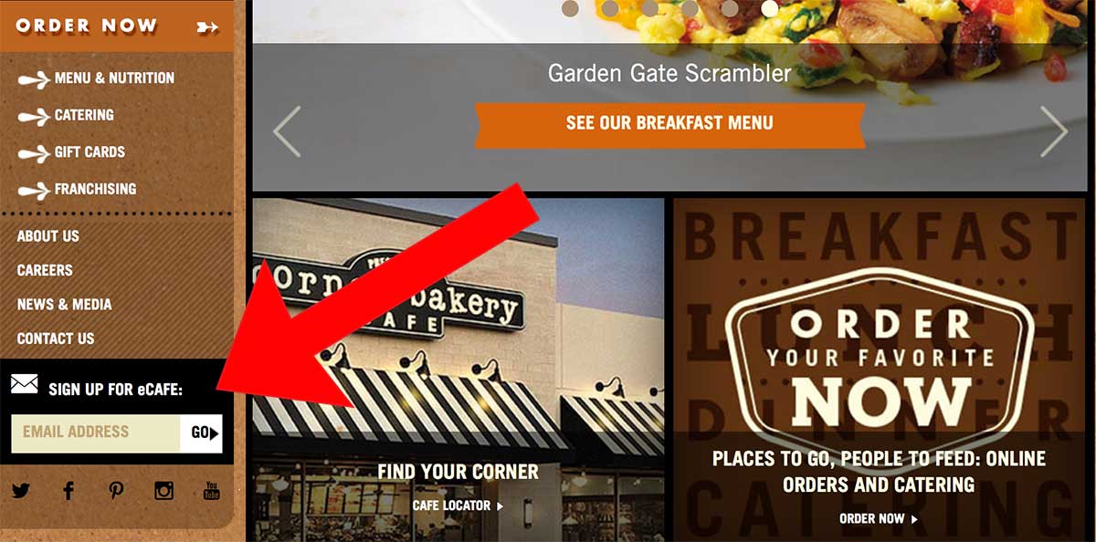
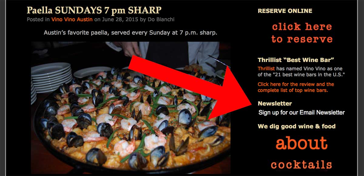
For best results, don’t just add a link to a page that has the opt-in box. Embed the opt-in box itself into these spots.
Here’s an example. Do this:

Not this:

Caption: An email sign-up prompt is always good, but embedding the actual opt-in form in your navigation is better than adding a link to a sign up page. You’ll get about double the subscribers if you use the embedded form.
These opt-in prompts should include a word about how often people should expect emails from you. Also add a tiny note that you’ll never spam them. Consider adding a link to your company’s privacy policy.
3) Include an incentive to join your list.
Not to belabor email, but if you want to get results from your sign-up boxes, you’ve got to give people a good reason to sign up. Maybe 20% off their first order or a chance to win a great monthly prize (make it worth more than $100 and something your ideal customers would really want).
The novelty of getting an email wore off about a decade ago. Now we’ve all got to really sell people on the benefits of signing up for your list.

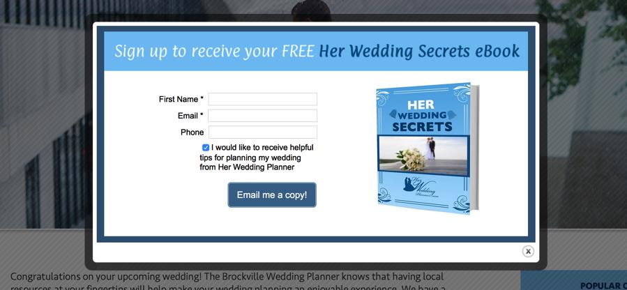
Caption: This local wedding planner offers a free ebook if people sign up for her email list. That’s a good start, but often discounts work better, especially if you sell products.
4) Include a contact us form.
I mentioned the
“contact us” form earlier. While it’s good to have just a basic page with your contact information and hours of business, it’s even better to give people a way to leave an inquiry after business hours.
This doesn’t have to be a wildly complicated form that calculates exactly how much it will cost to do a job, or a form that reveals your schedule for the next year. Something simple will do. Price quotes are popular for service businesses. Rate cards are good for professional services. A “Services” page with prices listed works well for beauty parlors. Of course, a basic menu does the job for restaurants and bakeries.
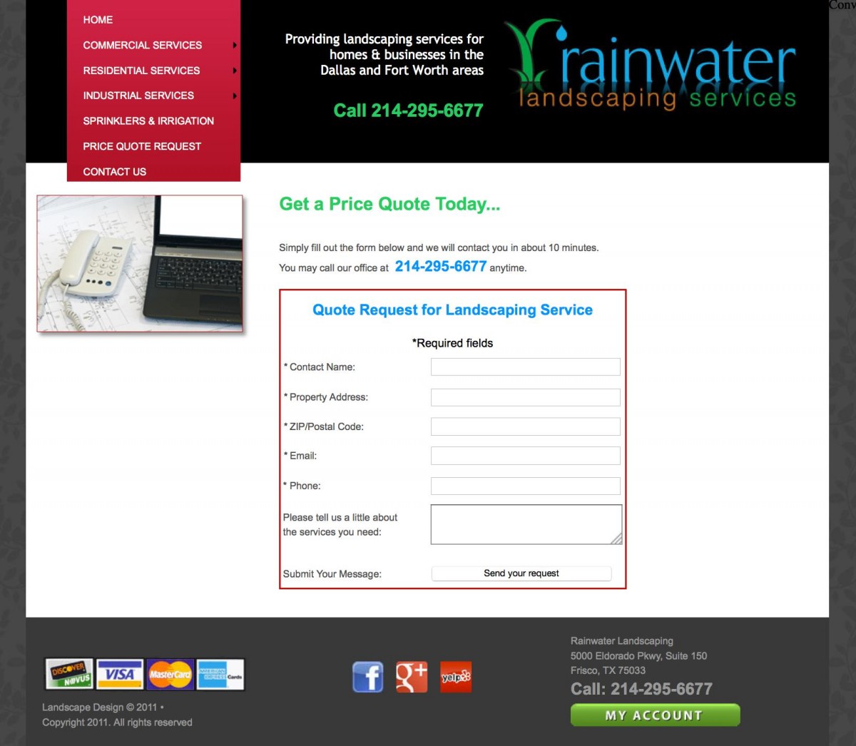
There’s an example of a simple price quote form below. It’s nothing fancy, but if a prospective customer checked this website after hours, they’d be able to move forward on their project without having to wait for the owner to call back. Too often, by the time an owner can call them back, the anxious prospect will have hired someone else.

There’s a way to take this even further if you want. Offer a quiz or online assessment. People love quizzes. Online assessments are even better, because we all think we’ve got a special situation. Online assessments can also save time because you’ll know more about what your prospective client needs before you get on the phone with them.
4) Do basic SEO optimization
When we tallied up the results of our 2015 Small Business Survey, we were surprised to see how few businesses did any kind of
search engine optimization. Only 30% of small business owners said they used search engine optimization to promote their business. This might not seem like a direct way to get more leads, but actually it is. To paraphrase the movie, “just because you built it doesn’t mean they’ll come.”
Search engine optimization is obviously a huge topic. It can seem complex, and it changes all the time. Unfortunately, none of that gives you a good excuse to ignore it. If you were willing to invest in your website in the first place, you should put a little time (or a little money) into getting it found.
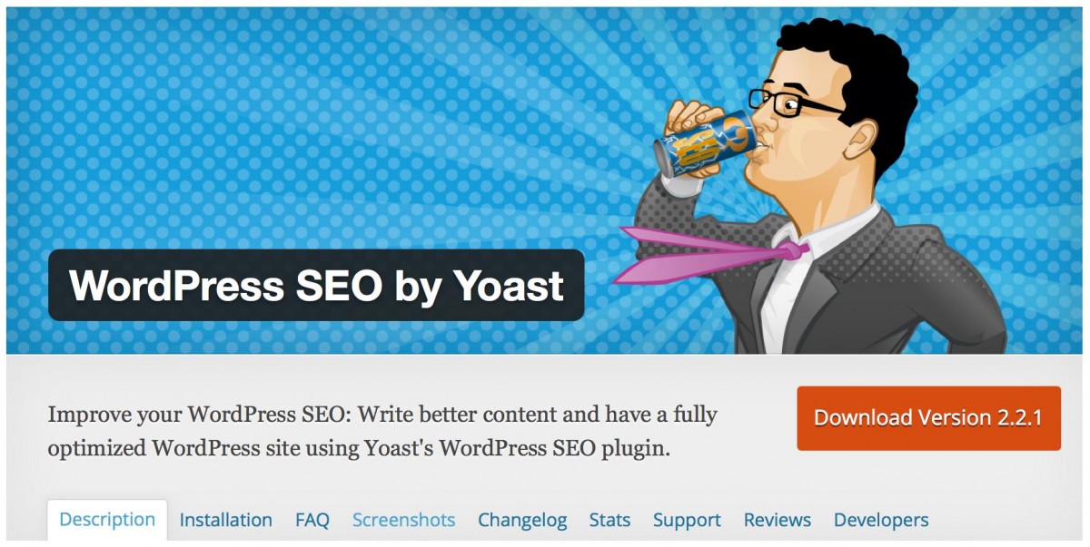
Even if all you can do is to add your town name and neighborhood name to your title tags, that’s a reasonable start. Fleshing out your Google My Business account will help, too. You don’t have to become an SEO expert overnight, or ever. If you’re using the WordPress platform for your business website, look into the plugin WordPress
SEO by Yoast. It’s free, effective, and super-easy to use.

Don’t ignore SEO just because it seems like a pain. It’s worth your time to learn at least the basics of optimizing your pages.
5) Include customer/client testimonials
Testimonials are one of the
best ways to build confidence. We’ve talked about how testimonials can help SEO rankings, but that’s just the tip of the iceberg. A testimonial (or series of testimonials) right below a contact form can double the leads generated. If your business is blessed with more than five or six really positive reviews or testimonials, make a whole page of your site for them. Of course, ask permission before you use someone’s name or photograph.
Want more testimonials? Ask for testimonials and permission to use them on your site right after you’ve just given a customer a “Wow” moment. When you’ve just shown them their new pool, or shown them you can save them a few thousand on their taxes, they’re most likely to say yes to giving a testimonial. Especially if you mention how much it would help your business.

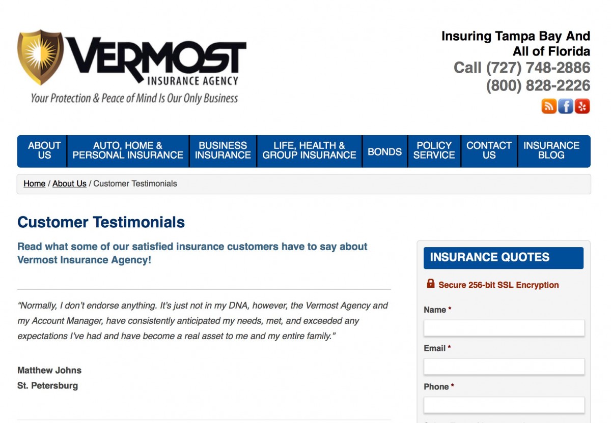
Caption: This local insurance business has an entire page of customer testimonials.
6) Make sure your site pages load in less than 3 seconds.
A slow site can drive visitors and potential clients away fast. Just shaving a second off page speed load times can increase conversion rates by 7% or more. Fast pages also reduce website bounce rates, too, so people will stay on your site longer.
To find out how quickly your site’s pages load, use a tool like
Pingdom’s Website Speed Test. Then head over to
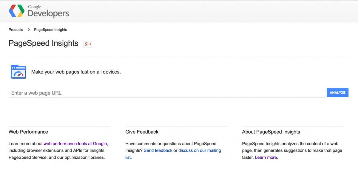
Google’s PageSpeed Insights Tool to find out exactly what you need to fix to speed up your site.
If your web development skills are a little weak, the results the PageSpeed tool gives may be confusing. Work with a web developer to fix the basics, just enough to get your pages under the 2-3 second mark.

7) Make sure your site pages look good on mobile devices.
Mobile, mobile, mobile. We can’t stress it enough. Constantly be testing and using your site on different mobile devices. That’s what your customers are doing.
8) Use landing pages to for specific kinds of traffic.
When you’re short on time, it’s really tempting to just send people to your site’s home page, rather than fuss around with a dedicated landing page. Owners who fuss with landing pages get way more results from their advertising, their social media work, and everything else they do.
Do yourself a favor and set up a fast, easy way to create and customize landing pages for all your promotions. You could get as much as twice the results. Tools like LeadPages, Instapage or Unbounce are affordable, widely used and easy to use.

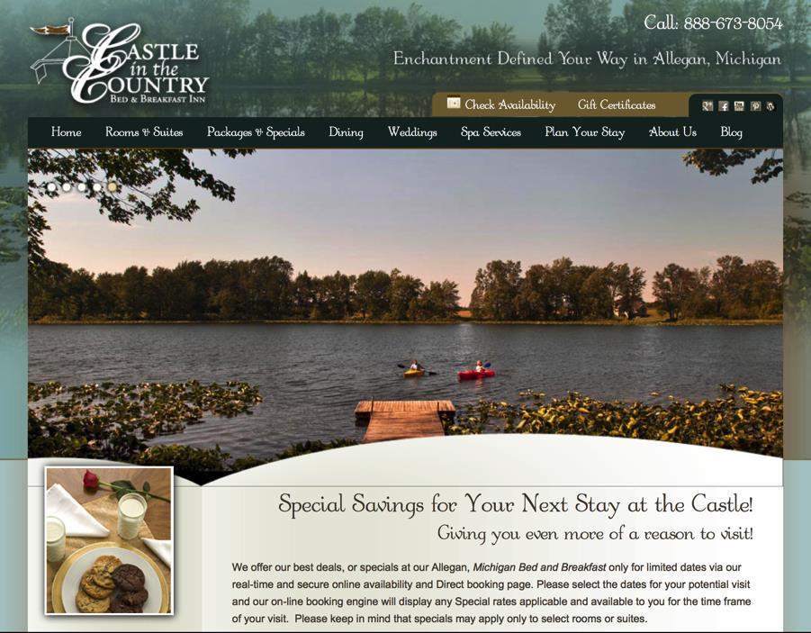
Caption: This is the landing page visitors are brought to when they click on any of the pay per click ads this resort runs for “Michigan vacation deals”.
9) Give people a way to see your work and how you work.
Your website
should be able to speak for you when you’re not available. It should be able to describe your services, your experience and your approach well enough that someone could make the decision of working with you (or not) based on what they find on your website. Depending on your business, this could be as simple as a bunch of photographs. Maybe a few videos are required. All these assets can also be posted on your Facebook page, too.
It all boils down to this: Your website should be able to tell your story. Don’t be stingy with the information on your site. People came to it to find out about you, don’t leave them empty-handed.
You can follow through on this just by doing a good job with your “About us” page. If you threw up a couple of paragraphs on your “About” page when you first launched, that’s okay, but go back now and really flesh it out. “About” pages are often the second most visited page on a site (second only to the home page), so you’ll be improving one of the most important pages on your site.

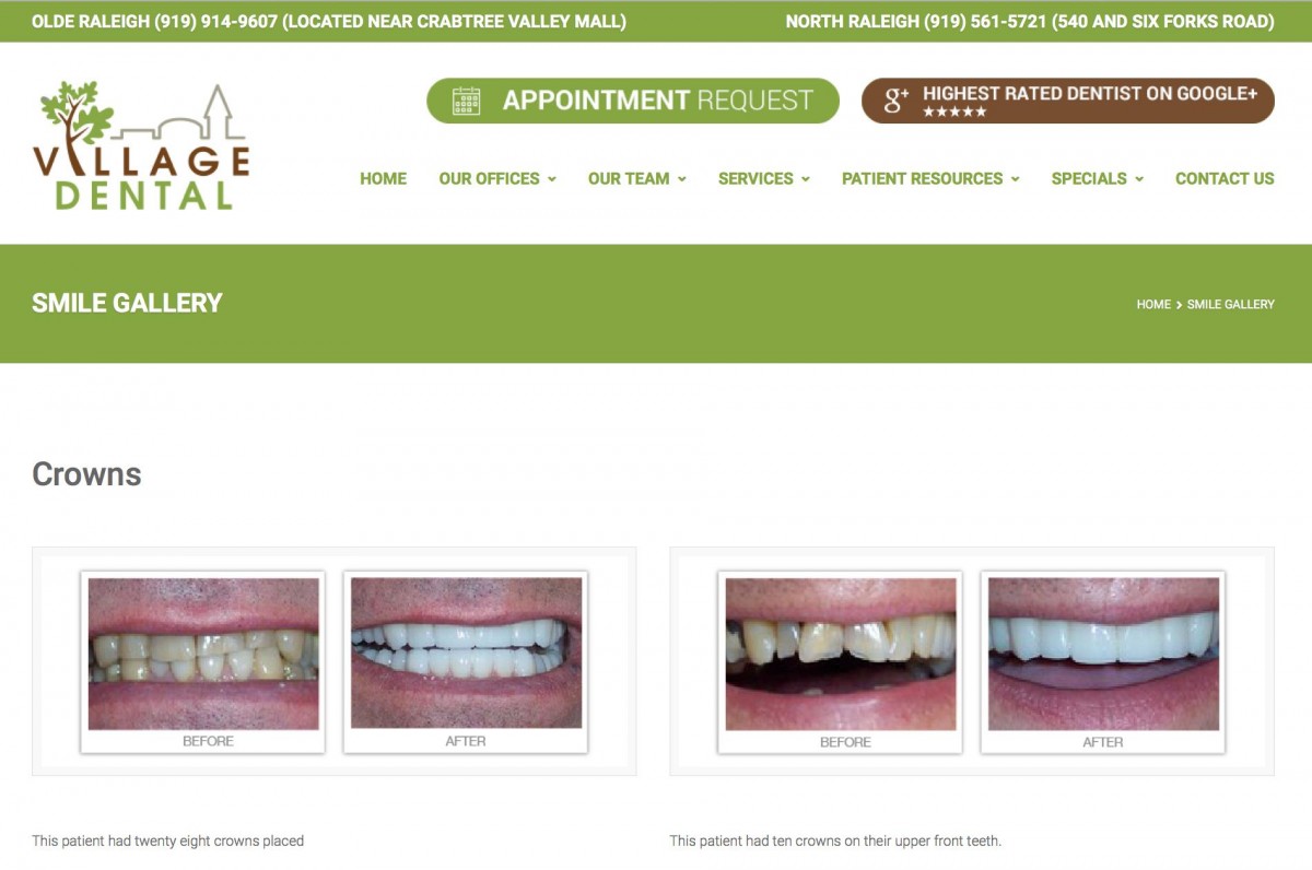
Caption: Before and after photographs of your work can be extremely persuasive.
10) Run a few A/B split tests.
Maybe you’ll need the help of a developer for this. Maybe you’ll need more website traffic (probably at least 75 unique visitors a day). That doesn’t mean you shouldn’t try some
simple A/B split testing as soon as possible.
The people getting the most results from their sites all test their lead generation forms. Maybe they test a button color or the sign-up incentive. Maybe it’s the header image, or the words on a sign-up.
An ongoing testing program can net out to more than double, even triple the leads over the course of one year. Testing might seem like a hassle, but what would three times the leads from your website mean to you? Share your answer in the comments below.

