Wasp Barcode Technologies: The Barcode Solution People
25 Things Every Small Business Website Needs
Nearly half of all small businesses don’t have websites. It’s incredible, but true, at least according to the SCORE.org infographic,
Customer-Friendly Websites, published in December of last year. According to this study, only 51% of small businesses have a website.
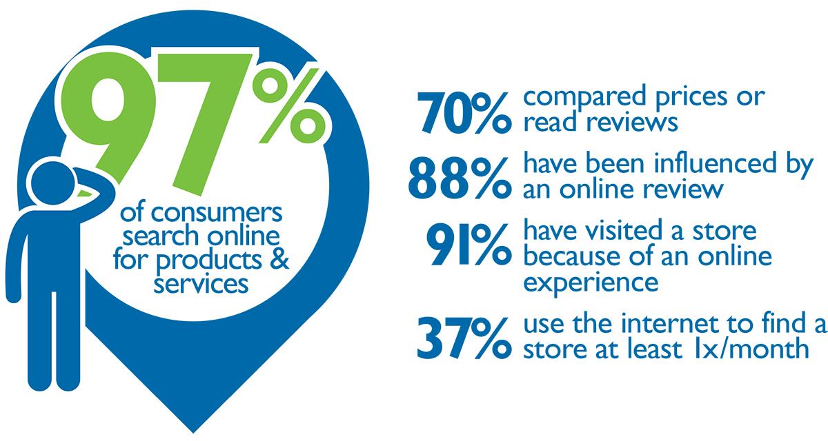
If you’re the owner of a business without a website, maybe you’re putting it off because you think most people don’t check the web for local businesses. If you believe this, I’d like to gently point out the following: 97% of customers search online for products and services.

Caption: from the SCORE infographic, Customer-Friendly websites.
Maybe you know people use the web to get information about local businesses, but you think a website won’t be important to your particular business. To be fair, that could be true. Most of the businesses we surveyed said their company website was important to their business’s success. To be exact, 59% said their website was, “extremely important,” “very important,” or “important.”
In fact, of the people we surveyed for our
2015 State of Small Business Report, only 9% of businesses said their website was not important at all. If nine out of ten people tell you something’s important, usually that means… it’s important.

The last common holdout on getting a website is because the owner doesn’t know where to start. This problem I can sympathize with. Getting a website can sound expensive, complicated, and technical. Just figuring out what you want on your website can be daunting. To help you out, we’ve put together a list of 25 essential elements every small business website should have.
None of these suggestions require expensive setups. None of them are bells and whistles. These essentials to your website are listed here because they help generate revenue. You can be among the 59% of owners who say their website is important to their business.
Before we launch into the list, here’s a
sample website, that has many of the elements we’re going to recommend. Peter Welch’s Gym managed to get a lot of website essentials on their home page.
Contact Information
1) A phone number.
This is the most basic piece of information a website can have. And yet, according to the SCORE study 27% of small businesses do not have a contact phone number on their website. Make sure you’re not part of that 27%. Put your phone number on every page, preferably near the top so people don’t have to scroll to find it.
2) An email address.
This should not be a free email address (suzieq@gmail.com). Your email should include your company’s web address at the end, like this: SuzieQ@SuziesAccounting.com.
3) Your hours of business.
Your hours of business are a super-important piece of information. Consider putting your hours in the header area of your website, and at the bottom of the pages (sometimes called “the footer area”.) Don’t forget to update your business hours for the holiday schedules.
4) Your location.
Include a street address and a mailing address, if those are different. This is another piece of information, so important, you might want it in the header and footer on your site.
5) A map – i.e., the image of a map showing customers how to find you.
This map will make it much easier for people to understand where you are located. If it’s easier for them to find you, they’ll be more likely to try to find you.
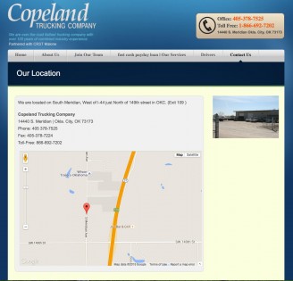
The example below shows the location page this business has created, specifically, to help people find them. It’s got a map, plus a photo of what their business looks like, their street address, and two phone numbers. There’s even a short line of directions to make things even easier.
6)Here’s how to add a map to your site:

- Take a screenshot of your business as seen on Google maps (the simplest solution, but not the best.)
- Use the Google Developer instructions to create a full-featured map. (the best solution, but may require a web developer’s help.)
- Use the WordPress plugin WP Google Maps (Nearly as good as the custom solution, and much easier, but only available if you’re on a WordPress site.)
7) A photograph of what your storefront or the front of your business looks like.
This is another trick to make it easier for people to find you. It’s also a demonstration that you’re a real business. Adding a business entrance photo also helps with marketing, if your storefront or your business address looks nice, people are more likely to want to do business with you.
8) A link to your Facebook page.
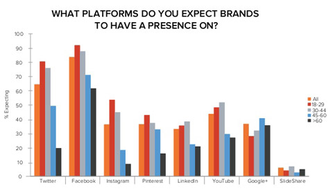
76% of customers expect a business to have a Facebook page. So get one. Try very hard to match your Facebook custom URL with the name of your business. Or, even better, the web address for your business.
According to the Hubspot report,
The Social Lifecycle: Consumer Insights to Improve Your Business, 70% of consumers aged 45 to 60 think a brand should be on Facebook. 95% of millennials expect a Facebook page. Those expectations may be lower for local businesses, but not by much.
9) A contact form.

What happens if someone goes to your site after hours, or when you’re not able to get to the phone? If they can’t reach you through your website, usually they’ll leave and call one of your competitors.
Don’t let this happen to you. Include a contact form on your site. Make sure you ask enough information so that when you get the inquiry, you can have an idea of what your prospect needs.
It should go without saying, but make sure you will get any inquiries from the contact form asap. Don’t send them to an email account you don’t check often.
Company Information
10) An “About us” page.
This is often the second-most visited page on a website. Don’t just type in a line of filler copy and leave it at that. Tell your story. Include some of the items mentioned below on your About Us page.
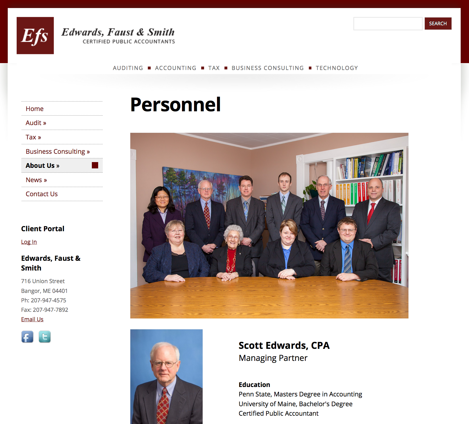
11) A photograph of the business owner.
This is typically on the
About Us page, but it could also be in the navigation column.
Add photographs of your employees. Include their names and what they help out with.
Caption: Adding photographs of you and your staff goes a long way toward convincing a web visitor that you’re trustworthy and someone they want to do business with.
12) A brief history of how long you’ve been in business, who and where you serve.

This should be in the first paragraph of your About Us page. In the second paragraph, include a bit about your work history, or a few sentences about what prompted you to start your business.
13) At least three photographs of your work.
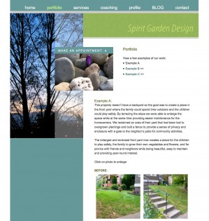
You know how “a picture is worth a thousand words,” right? It applies to your website, too. Before and after pictures are especially interesting, but whether you’re a garden designer, an auto body repair shop, a construction company, or a beauty salon, adding a few images makes people far more likely to do business with you. To borrow from another saying, we all have to “see it to believe it.” Let them see it.
Caption: This portfolio page from a garden design firm shows what they can do. It also helps new customers articulate what they want.
14) A page dedicated to the products or services you offer.

Include at least a sentence description for each product or service you provide. Include prices, too, if that makes sense.
Your services page is the whole reason someone came to your site in the first place to see if you provide what they need. So don’t leave them hanging. Give detailed descriptions of what you do and how you do it. It’s the best sales copy you can write.
15) Logos, icons or links to professional organizations you belong to.
Maybe it’s the Local Chamber of Commerce, or the American Personal Organizers Association. Whatever it is, include any credentials, associations, or certifications you have. Use the logo images of these verifications and link back to their sites.
Marketing/Branding Essentials
16) A logo.
If you don’t yet have a logo, it’s time to invest in one. The
website 99Designs can set you up with a terrific logo, if you’ve got the $299 budget for a logo. If you don’t, try Fiverr.com. You can get a logo there for $30-$40.
17) Customer testimonials.
This is perhaps the single best way to get more results from your site. Customer reviews are extremely important. These testimonials are so powerful that we wrote a whole blog post about them. If you’ve had anyone says something nice about your business, include it on your site. If you’ve got enough customers saying great things about you and your business, create a whole page of testimonials.
18) A call to action to come to your store/business or to call you.
If you were trying to sell something, would you skip the part of your pitch where you actually asked someone to buy? Would you just give them the information, and then walk off? Of course not.
So don’t forget this part of your pitch on your website. Include at least one call to action, ideally near the top of every page on your site. “Call now” might not seem very creative, but even this is better than nothing.
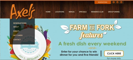
19) Some kind of coupon, discount, or incentive.
Your website needs to be persuasive enough to shake people out of their inaction. A nice looking website that offers what they need is a great start, but go one step further and offer them an incentive to call, visit your store, or try your services.
Even a printable coupon for a free cup of coffee will do. Maybe you can provide a 20-minute free consultation. Free ebooks are popular in some niches, but they don’t tend to work as well for local businesses.

Caption: This restaurant website puts their free offer – a chance to win a dinner for six – in the most prominent spot on their homepage.
20) An email sign-up form.
Email marketing is one of the most effective marketing tactics around. We know from our own survey that about 45% of small businesses use emails in their marketing arsenal. Whether you’re in the group that utilizes an email technique or not, start building your list now so you can.
You can get started with a free MailChimp account and grow your list from there. Adding the opt-in form to a website is easy, any good web designer or developer can do it in less than an hour.
Basic Search Engine Optimization
21) Unique title tags on every page of your site.
Title tags are pieces of HTML (the code that makes up your webpages.) These HTML title tags appear as the first row of information in the search engine results, like this:

Every page on your site should have a unique title tag. These tags should include words and phrases people might use if they were looking for that page. Use the free SEO Book Title and
Meta Tag tool to see how your title tags will look.
22) Meta description tags written to incite action in the search engine results.
These are almost exactly like title tags, except they create the two black lines of description copy in the search results. Think of these both as a way to describe your pages, and almost like sales copy, they need to incite people to click.
A Professional Website
23) A web address that’s easy to remember and spell.
If at all possible, get a .com address. Not a .biz or .net address. You may find that you can’t get YourBusinessName.com. You may have to settle for something else. Here are some
good, and not so good, website addresses:
Good
|
Not So Good
|
| SuziesSpeedyAccounting.com |
SuziesSpeedyAccounting.net |
| WozAndCo.com |
SuziesSpeedyAccounting.biz (avoid .net and .biz) |
| JeffsConstructionBoston.com |
JBPlumbingandHeatingPhiladelphiaPA.com (too long) |
|
WozniackisyAndCo.com (hard to spell) |
|
JeffsRtConstructAndRenov.com (impossible to remember) |
When you first start out there’s a powerful temptation to conserve every dollar. That’s a fine motivation, but don’t go cheap on your website hosting. It’s important that there aren’t any ads, and it’s critical you can be sure your site won’t be down, won’t get hacked, and is completely under your control.
Besides, paid hosting shouldn’t cost too much. You can get a decent package for under $30 a year, and get a nice package for about $100 a year. It’s worth it.
24) Pages that load in 2 seconds or less.
Have you heard? People are impatient. They’re especially impatient with websites. Every page on your site needs to load in less than three seconds, and ideally in less than 2 seconds. Missing that 2-second mark could mean thousands of dollars in lost sales over the next few years, simply because your site is a little slow.
How do you fix this? Fast hosting will help get your pages to load quickly. So will keeping image sizes small. Beyond that, you may need the help of a website developer or a designer.
25) A design that looks good on mobile devices.
Most of your website’s traffic will come from people on mobile devices. Because of this, it’s absolutely critical that your website looks good and functions well on mobile devices. Despite how important this is, 93.3% of small business websites are not mobile compatible according to a SCORE’s study.
Being mobile-friendly may mean using a “responsive” design – a design that adjusts itself nicely to different screen sizes. It also means using a typeface that’s large enough for older viewers to read and that has good contrast against the background. In other words, no white type on a black background.
Conclusion
This information may not contain everything that you’ll want for your company’s website, but it’s more than enough to get you started, and to make your website into a revenue-generating machine.
